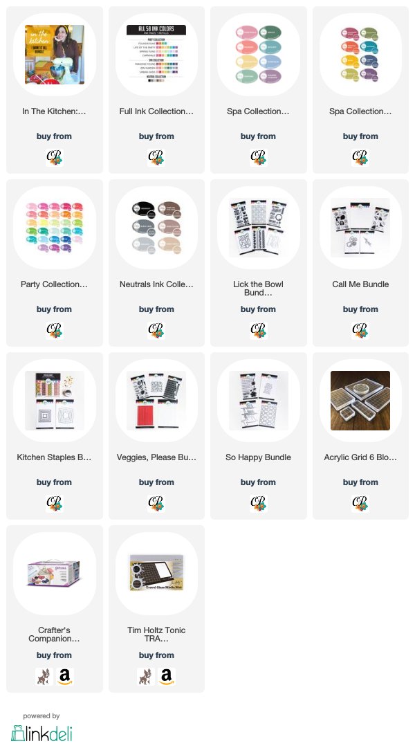
Hey there Artie! Welcome back to the blog! Today is release day for the “In the Kitchen” collection from Catherine Pooler. I’m marking this occasion with a special post on Catherine Pooler Inks and some of the projects I created with the In the Kitchen Collection.

For StampNation members release goes live 1/28 at noon. For everyone, release goes live 1/29 at 9AM Eastern.
After a year and three months of using Catherine Pooler Inks, I have to share the top 10 reasons I love them. You will often hear me say they are luxury class inks. When I use these inks, if feel like I just into my leather upholstered Chrysler. I like other cars my Chrysler is real comfort. Catherine Pooler Inks have a really special place in my design repertoire for ten reasons… You can watch me share these reasons in the video below, or keep reading!

1. Sponge Pad
First of all, the sponge pad that holds these inks holds the ink well, but also releases it well. The sponge gives way to unparalleled coverage on the first impression (see #8 below). The sponge allows you to squeeze ink out onto your work surface or to create swatches without stamps. Linen and Felt pads have advantages of their own, but when I need a generous helping of ink or great coverage, I reach for Catherine Pooler Inks.

2. Colors
The colors come in three collections and combine perfectly for very popular palettes and blending. The Party Collection features bright and vibrant colors that work well for fun and exciting designs. The Spa Collection tones the colors down a bit for a sophisticated and even more masculine feel. The Neutral Collection has fantastic browns and grays in three shades each.
3. Easy to Refill
Refilling the sponge pads is a cinch with the re-inkers. They have a rounded tip that you can use to squeeze out the ink onto the pad and then gently massage it to evenly distribute the ink across the sponge. I actually keep two sets of refills on hand just to be sure I’ll not run out anytime soon.
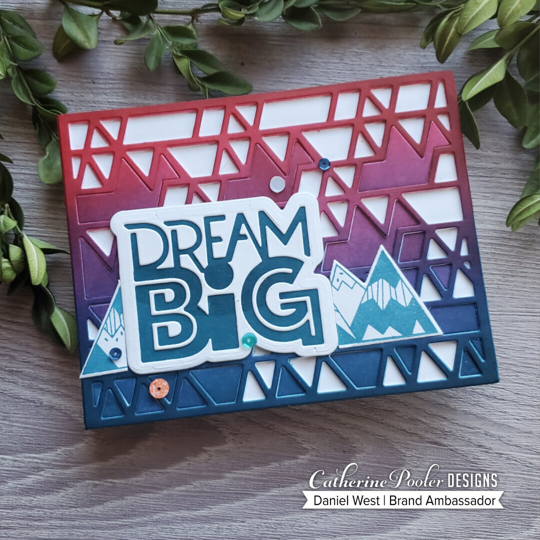
Check out the blending on this project. All CP Inks with blender brushes.
4. Blend Like a Dream
These inks blend like butter. I use them with Taylored Expressions Blender Brushes and Picket Fence Blender Brushes. The do not dry super fast, leaving time for them to play well with other colors on the surface of cardstock. When they dry, they dry evenly and smoothly for a beautiful finished look.

5. Make your own colored cardstock
When you want to coordinate ink with cardstock, you can take your pad directly to paper and create your own colored cardstock. I probably do this every time I craft. I do not have to purchase extra colors of cardstock when I use CP inks, I just create my own with the sponge ink pads. When freshly re-inked, they apply ink without being splotchy and inconsistent.

6. Coordinate with stamp sets and paper packs
Another bonus, CP and her team design paper packs for every release that coordinate with sequins and ink colors. They take the guess work out of creating with their products. Of course, I love the whimsical and retro looks Catherine Pooler offers, I have also come to rely on their coordination with ink and paper colors for creating fantastic designs.

I created this card with the Lick the Bowl Bundle and the Kitchen Staples Bundle.
7. Water Reactive
Since CP Inks are dye inks, they react to water. You can use them to watercolor with a brush pen, too. I like to blend inks over a panel and then spray or flick drops of water over it to see the inks react . It’s not quite like a vampire getting hit with holy water, but you get the idea.

8. Coverage
Number 8 actually should hold the number 1 spot. Coverage Coverage Coverage. I really enjoy stamping with the CP acrylic blocks because I have confidence the image will lay down pretty solidly the first time. You can test the stamping on a separate sheet of paper first, but I have learned that with a well inked pad, I am going to be able to produce a clean and crisp image the first time I stamp it down. The ink evenly covers your stamps like it was oil. It does not bead up on my stamps, either, so I now it will lay down without splotches. If I do get a weak impression, it’s most likely my own fault for not pressing firmly and evenly, or for not inking up my pad well. Check out the impression I got on this mixer stamp from the latest release, “In the Kitchen.” If you watch the video you’ll see I stamped it one time and it’s perfect!

9. Embossable
CP Inks stay wet for just a bit after hitting the paper. This allows them to grab onto embossing powder long enough to melt it for a beautiful finish. I like to add clear embossing powder to colored sentiments for a bit of shine. Try it out!! You can check near the end of the video to see this in action.

10. Community
Finally, Catherine Pooler Inks have a great community built right into them. It’s called StampNation. You will find a huge group of fun and very talented friends playing along to challenges, meeting new stamp companies and learning with free master classes there. Its like having a crafting university at your fingertips and colleagues ready to help all of the time. I actually had the privilege of teaching a card class on StampNation called, “Dude, Where’s My Card?” It focused on tips for creating masculine cards.
So there you have it! Ten reasons why I LOVE Catherine Pooler Inks. Today is release day for the In the Kitchen Collection. I hope you’ll consider picking up ink as well as some bundles from this fun retro collection. I appreciate you using my affiliate links when you shop to support my creative efforts at no additional cost to you. I hope you have a wonderful rest of your week.